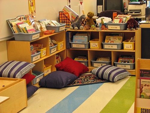
If you ask a teacher what affects and influences how the learners in his / her class learn, you would get a range of different responses; such as teaching strategies, curriculum and teacher's personality and relationship with learners. It is unlikely that the teachers would speak about the possible affects the colours in the classroom would have on learners' learning. However using a variety of colours in a classroom reduces passivity and boredom. So your classroom should
incorporate various colours to reduce monotony and visually invigorate learners. Consider the age and gender of your learners, as well as the subject and activity, when selecting the colours. Be aware that the colours for a school environment can enhance or impair learning, as well as affect behaviour and even the morale of the learners.
The Knowsley Metropolitan Borough Council, in North West England conducted a participatory project with school communities from April to June in 2005. The Knowlsey report concluded that learning facilities should be altered to support the learners' noted modes of learning, the report commented that the learners used: looking, concentrating, thinking ahead, matching / comparing, creativity, listening, searching, negotiating, teamwork and learning. (School Works, 2005) Colour is one way to positively enhance and change the learning space for a minimal cost.
Schools have a many types of venues where learning takes place. Simmons (1995) stated that colour in the learning environment improves visual processing, reduces stress, and challenges brain development. Visual stimulation rewires the brain, making stronger connections while nurturing visual thinking, problem solving, and creativity. Therefore the colours we use in a learning environment should maximize information retention and stimulate learner participation.
Colour is all around us, where we live, what we wear and the beautiful natural environment around us. We regularly refer to colour in our daily lives, for example we refer to someone who is embarrassed and blushes by saying they're as 'red as a beetroot', while someone who lacks knowledge we may say they're 'green behind the ears', or when someone is shocked or afraid we may say they are as 'white as a sheet'. Every colour has a unique effect on us as individuals and stimulates various reactions. The fast food companies use this effect by including red, yellow and orange colours in their packaging and restaurants, as these colours are said to stimulate our appetite.
|
|
The purpose of a learning environment can be defined by the use of colour in the space. Colour can be used to create an atmosphere, such as a quiet, relaxing space or a collaborative and interactive space. Research about colours and emotions shows a direct correlation between negative and positive feelings and the venue's colour.
Schools generally choose practical colours, such as dark desks so dirt cannot be seen easily, and all walls painted the same colour to reduce paint costs. These practical colours are often boring and do not stimulate learning. Elizabeth Stout, an Ohio-based interior designer, expressed the idea that school furniture is usually chosen based on functionality, ergonomics and durability, rather than on its colour. The learning space is influenced by the various design aspects, including the choice of colour, such as the furniture (design, arrangement, grouping of), lighting (type, brightness, colour of light) both natural and artificial, flooring (concrete, tiled, wood, bamboo, carpeting) and the ceiling. When planning a learning space we should consider the colour scheme to be used on all the items; the main colours on the walls, floor and ceiling as well as the accent colours of the classroom furnishings and fittings.
Affect Colour Has On Us
When selecting colours for a learning environment, we need to be aware of the effect of the different colours. Reds, yellows and orange colours are considered warm, stimulating and lively colours. Cool, calming colours
are blues and greens. Faily (1979) reported findings that visual stimulation by the use of warm colours and bright lighting may cause increasing muscular tension, respiration rate, heart action, blood pressure and even brain activity. Cool colours and dim lighting bring about relaxation and could even result in sleep. Warm and cool colours make people perceive different temperatures, such as warmth or cool, depending on the colour. Therefore colour should be incorporated into the learning space to promote brain activity and a comfortable learning environment. Brain research shows that more than six colours could distract learners and may even negatively impact a learner's cognitive ability.
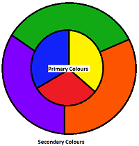
Warm colours - Reds, Yellows and Oranges
These warm and bright colours are interpreted as happy, inviting colours. Red and orange are seen as stimulating. Yellow is interpreted as bright and cheery. Large amounts of these bright colours, such as reds, yellows and oranges, may cause overstimulation in a learning environment.
Red stimulates a faster heartbeat and breathing, and is seen as an emotionally intense colour, the colour of love. Red is the most vibrant of all the colours. It stimulates the adrenal gland and the neurons. Red is an extreme colour and could become overpowering, therefore red should be used rather as an accent colour, instead of covering all the walls in a room. The accent areas in a classroom could be some table tops or notice boards. The red will draw the learner's attention, however not as much as yellow. Introducing red brings warmth and balance to cooler room where blue or green is painted on the walls. Note that red should be used very sparingly in areas where autistic learners are taught. As red may not help in confrontational situations, it should not be used in spaces were conflict may need to be resolved, for example a school leader's or deputy's office.
Yellow attracts attention faster than any other colour. The reason is that yellow helps to release a chemical in the brain called Serotonin, essential for causing a happy mood.
De Bono in his Six Hat Theory chose yellow as the colour of "positive thinking" and identifying benefits. Yellow stimulates the brain into rapid thinking and is said to generate quick and rapid thinking, brainstorming and could stimulate discussions within the learning area. Yellow, particularly yellow-orange or bright yellow, will allow for stimulating discussions, but will also in all likelihood increase the noise level, this may be distracting when used for large learning areas.
Light yellow instils or encourages feelings of happiness and comfort; it is seen as warm, summery and lively. Light yellow combined with green are the preferred colours for large areas used by high school learners.
Cool Colours - Blues, Greens and Purples
Cool colours produce feelings of calmness, relaxation, happiness and comfort. It is best to have a calming and / or neutral colour on the walls, but it may be a dull room, so the furnishings would be used to add colour to the space. If the idea is to match the colour of all the aspects of the room, use the calming greens and blues on the walls, and make the furniture in similar shades.
Blue, especially lighter blues, are said to have a soothing effect on our minds as these blues help to produce some calming chemicals in the brain. De Bono chose blue as the hat for promoting and focusing on problem solving, to look for new ideas and leadership, as well as to represent metacognition (thinking about thinking).
Darker blues are often associated with dignity and loyalty. When having to work individually or participate in tasks that require deep thinking, people seem to be more productive when the room is painted blue.
Lighter blues are seen as peaceful and tranquil colours, promoting feelings of calm. Using light blue on learning space walls seems to encourage learners in these spaces to concentrate and attend better; the colour also seems to assist learners in keeping them on task. Light blue and natural light seems to promote concentration, while lowering blood pressure.
Green is described as a calming, refreshing colour, it assists in relaxing the body and alleviates stress. Green is the easiest colour on the human eye, (this may be why classroom boards where green). Research has shown that green may improve vision and focuses attention on other areas, e.g. red or yellow notice boards or interest corners.
Green has been used successfully in areas where autistic learners are being taught, especially where the floors and walls are duller shades of green.
Neutral colours
In art black and white are described as neutrals, while designers regularly include shades of ivory and tans as neutrals.
|
|
|
|
White reflects light, and is important in classrooms to make small spaces seem bigger. However, white shows dirt and is therefore more difficult to keep clean than other colours, and thus impractical in classrooms as it will show scuff marks.
White light is really important to lower blood pressure and can assist in managing some behavioural issues in classrooms. For classrooms, it is important to remember that there are many different kinds of 'white'. It ranges from cold white with blue and purple undertones to pinkish and yellow which are warmer, and perceived to be 'friendlier'. Depending on the effect you want to achieve, decide carefully whether you want to use white on large wall areas, as it can be harsh on the eyes and show marks, but will not compete with accent areas like bulletin boards. When used on ceilings, the rooms will seem bigger and the less confining.
Colour for the learning spaces of different age groups of learners
Research shows that colour affects learning, communication, productivity and even emotion. Colour can influence learners' studying and working results both positively and negatively. The power of colour can cause learners to become excitable and hyperactive or bored and uninterested, so make careful decisions when deciding what colours to use when designing a learning space.
The age of the learners using the space and their reaction to colours needs to be carefully considered when deciding on how the various areas within a school will be coloured. Different age groups relate better to certain colours rather than other.
Pre-school and Foundation Phase learners are attracted to bright and warm colours, especially

red and yellow. Young children work very well in bright, colourful environments. The bright colours are useful in attracting learners' attention, but they may not be favourable in creating enabling learning environments.
Some suggest that learning areas for preschool and foundation phase learners should use warm, mild and soothing colours as the main colours, such as warm, soft shades of whites and light creams. Then the brighter colours should be used as accents and focal points.
Other research suggests that during this foundation phase bright colours should be used on the walls and on the furniture of these learning spaces, creating a vibrant and exciting learning space. The bright colours can also be used to assist the children understand the different areas of the room. For example, blue cushions in a corner may be used
as a reading and relaxation area, while red tables in another area may be as a free-play space.
Remember that learners' art is often displayed on the walls, so the wall colour must not clash with the artwork, but should enhance or 'frame' the artwork. Which ever colour use idea you decide on for the Foundation Phase consider the learners in your school, and what would encourage them to learn most effectively.
Intermediate phase learners seem to prefer tints and pastels shades of colour. These should be used on a main classroom walls, floors and ceiling, with the main teaching wall a slightly deeper shade of the same hue. Bright accent colours can be used to attract learners to various areas within the teaching space.
Senior phase learners seem to prefer larger areas of bright medium-cool colours, as they move
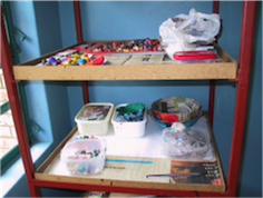
into adolescence, rather than bright, primary colours, which they see as babyish and immature.
Teenagers often reject neutral colours and prefer blues, ultramarine and are regularly influenced by fashion trends, and therefore the current fashionable colours. Frank H. Mahnke (1996) recommended cool colours for middle school and high school classrooms because these colours had the ability to relax and focus learners' concentration.
High school and FET learners prefer green and light yellow colours. They also relate to blue and purple as relaxing and calming colours. They associate with and see the significance of red as the colour of love and romance. The other colours they relate to are colour-blends such as blue-green, red-purple, yellow-red, and purple-blue.
Subtle colours, such as light sage greens, refreshing blues and greens, work well when selecting a colour scheme for middle (senior phase) and high school learners, for the wall, floor and ceiling colouring. The brighter, trendy and more saturated colours work effectively as accents with items such as the furniture and notice boards.
Different colours for different school venues
In a school bright notice boards and colourful furniture can transform a plain, dull room into a
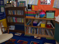
bright and stimulating space, capable of holding children's attention.
In regular classrooms, learners and teachers need to feel safe, stimulated and motivated, but be aware of over stimulation. An idea is to paint the main teaching wall a brighter or deeper tone than the other classroom walls. The deeper or brighter colour attracts learners' attention to the front of the classroom. The lighter or more subtle shade of the other classroom walls creates a varying visual interest for learners' eyes. The more subtle wall colour would also enhance notice boards and learner's work or other displays which use pops of colour, within the classroom.
As furniture does not use large amounts of colour, bright colours could be used on the furniture. Yellow furniture would induce feelings of excitement, energy and happiness. Red and orange could be used to attract learners' attention various areas of the classroom.
Using colourful walls in parts of a Media Centre would brighten the space and make it feel warm and cosy, which would encourage learners to use the space, stay and hopefully read. Pale or light greens and blues could also be used in other areas as these colours enhance quietness and concentration, which in turn could assist learners who are studying or working.

Consider the areas where technology will be used, especially if its desk-tops choose colours that assist in reducing eyestrain and glare. Dark colours could be used as a background to technology screens, such as data-projectors, televisions and video monitors to avoid distraction.
Edges of the bookcases and storage cabinets could be painted with bright colour, to attract learners and focus on specific areas.
ELearning spaces
Schools are creating e-learning spaces, also called "learning neighbourhoods" or "learning studios"", they are often open learning spaces. These environments are to encourage learners to interact, collaborate and engage in their learning.
The focus of these learning environments is on creating spaces for groups of learners to learn and interact, where they feel safe to take risks with as they are learning and working collaboratively.
These spaces may also include areas where learners can work individually on a task. In the area where individual learners would work on their mobile devices, could be seen as similar areas to reading space. These spaces should be calming and relaxing, to achieve a calming and relaxing effect match wall colours that are calming like greens and blues with similar furniture colours to maximize the effects of colour in this space.
The planners of these learning spaces need to be aware of the influence and effect the actual openness of space has on the learning of the learners, therefore the colours used, furniture chosen for groups of people, the type of lighting, both natural and artificial, and even the flooring needs to be considered carefully before choices are made. These spaces could be multi-purpose and for that reason careful attention needs to be taken when selecting the colour.
In the interactive and conversation areas, the colour could provide excitement and interaction. Think about using neutral wall and floor colours, then fixed colours on lounging couches or chairs, and vibrant accents on table-tops or shelving and experimenting with pops of bright colour for the furniture cushions. Colour selections might include deep reds, oranges and yellows, or pastels in any colour combination.
The colours we use in these spaces should inspire and stimulate learners to interact and engage in taking learning risks, brighter colours would be useful for that. While cooler colours would
assist learners to encourage time on task and inspire learning. So, both bright colours to stimulate and encourage debate, and more subtle colours would be used to create a truly, conducive learning space.
Workshops and laboratories
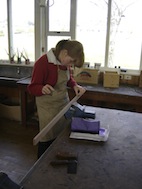
The situation changes in technical or workshop school environments because the learning activities are different from those in a traditional classroom. Mild and mid-toned wall and floor colours help reduce the contrast between workstations and surroundings. Colour accents or contrasts can be used in a way to highlight the use of the workshop, for example in a car repair workshop, metallic finishes colours similar colours to those of vehicle finishes could be used, to enhance the learning environment. Where computers are used a lot, eyestrain and glare are common problems, use colours to reduce the glare and eyestrain.
Other areas:
Corridors and staircases are ideal spaces to use bright and happy colours where learners move from one area to another. They can also be painted school colours to express school pride and
awareness.
In conclusion, as schools we should consider including colour into the various learning spaces and environments. Our learners live in a bright, interactive environment, and school has to compete with that, so let's make our classrooms spaces where learners want to spend their time, and that they spend their time there productively. Use colour as a way of achieving this goal.
I love to hear from you, the readers, plesae email me at: karen@walstra.co.za . Follow me on Twitter @KarenWalstra . Add to the conversation on the Blog comments! Be inspired!
If you would like me to do workshops with your staff, view the website and contact me on the Contact page.
References:
Badenhorst, M. (online) Colour in Classrooms. Teaching and Learning in a Digital Age.
Daggett, W.R., Cobble, J.E. & Gertel, S. J. (March 2008). Color in an Optimum Learning Environment. International Center for Leadership in Education Retrieved from http://www.leadered.com/pdf/color%20white%20paper.pdf
de Bono, E. (online). Six Thinking Hats. The de Bono Group, LLC.
Engelbrecht , K. (2003, June) The Impact of Color on Learning. NeoCon 2003 Perkins & Will, Chicago, Illinois.
Mahnke, F. H (1996) Color, Environment, and Human Response. John Wiley& Sons. New York. NY.
Morton. J.L (1995-2012) Basic Color Theory. (online).
School Works. (2005, June). Knowsley School Design Festival: Learning Centres for the Future-Final report. School Works Ltd. London.
Thompson, S (2003). Color in Education. School Planning and Management. Published by The Peter Li Education Group.
Wikipedia (online). Six Thinking Hats. Wikipedia, the free encyclopaedia.


